Lots of interesting maps out there these days. Here are a few that tell their stories better than most...
Marsh is a insurance broking and risk management firm with a pretty long track record. Founded in 1871, you have probably never heard of them because they work with big companies to help them figure out their insurance needs. They do about $6 billion a year and have upwards of 30k employees in 130 countries.
What I like about them is that they put a lot of their research online. Obviously, all of it has an insurance "edge" to it (that is probably less exciting than it sounds, by the way) but you don't have to wade through a ton of small print to get to some meaty stuff on just about any region of the globe.
Which is why their Political Risk Map is so interesting. You can take a look at a screenshot of part of the map below but to find out what all the pretty colors mean and to see the rest of the world, you are going to have to go to the site itself.
 |
| Marsh Political Risk Map |
The first was put together by the Asia Maritime Transparency Initiative. AMTI is housed within the highly regarded Center for Strategic and International Studies and offers a substantial body of analysis on issues in and around the South China Sea.
Particularly impressive is the map below (just a screenshot - click the link for the interactive version) that lays out all of the claims and counterclaims to various chunks of ocean in the area.
 |
| AMTI Maritime Claims Map |
 |
| Concrete and Coral |
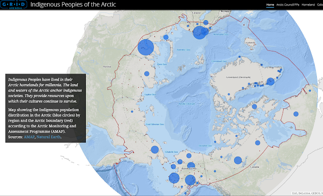
GRID-Arendal was formed in 1989 in an agreement between Norway and the UN. In their own words, "We transform environmental data into credible, science-based information products, delivered through innovative communication tools and capacity building services." Their maps (and the accompanying text and data) on indigenous people in the Arctic Circle certainly accomplishes this goal. Again, I provide just a screenshot of one of the many maps and resources they have provided below. Check the entire site for more!
 |
| Indigenous Peoples Of The Arctic |
NOAA provides a very cool interactive mapping tool that let's you examine historic hurricanes and their tracks in a number of different ways. I was curious, so I set out to find how many hurricanes had impacted the Erie, Pennsylvania area (where I live) Much to my surprise, there were five since 1955! Check out the full site to search for your home town.
 |
| NOAA Historical Hurricane Tracks |


